System Administration
CatDV Security Concepts
CatDV Server Enterprise gives you complete control over which users can access which catalogs, and also what operations those users can perform on the catalogs they can access. This is achieved by creating appropriate Users, Roles and Production Groups and defining Permissions for them.
It is therefore important that, before creating a security configuration for CatDV Server, you understand these concepts.
Users
Everybody who requires access to CatDV Server must be allocated an individual user account and associate password. They will need this to log on to CatDV Server and access shared catalogs. A CatDV user is created by an administrator using the CatDV user admin panel and is distinct from the operating system user.
Note that creating CatDV users and setting their permissions only controls access to the metadata held in the CatDV database. It does not prevent users physically accessing the media files if they have access to them via the file system.
Roles
Each user must be allocated at least one primary ‘Role’ (such as Editor, Producer, Logger etc.), plus any number of addition roles. The user’s roles determine what permissions that user will have in each Production Group that they are a member of. The primary role is used to determine certain UI settings.
Production Groups
A Production Group is used to gather together all the catalogs that belong to a single logical ‘production’. The precise meaning of a ‘production’ will depend on your organization’s business model, but might typically correspond to a particular client or project.
Each catalog can be assigned to a single Production Group (or is “unowned” and belongs to no group). Therefore where a user has access to more than one production group, and they create a new catalog, it is necessary for the system to know which production group a newly created catalog should be a member of. This is achieved by the user specifying which group they are currently working in (i.e. which “hat” they are wearing today) when they log on. The user can change their ‘current’ group at any time without logging off and back on.
There is a special predefined group, the System Group (with id 0), to which you can assign users if you want to give them access to all catalogs and groups throughout the system (perhaps they’re a manager, or the system administrator).
A “system administrator” can create new groups and edit anyone’s permission. A “group administrator” can create new users and assign them to his or her groups only (and can also grant existing users of other groups access to his groups) but can’t create new groups or edit permissions for other groups.
Permissions
Having defined your user’s Roles and your Production Groups you can then use Permissions to determine what access users with a given role have in each production group. Permissions include such things as whether users with a particular Role are allowed to create or delete catalogs within a certain Production Group, and the whether they can create or delete clips within a catalog.
Group and Role Management
Management of Production Groups and Roles is performed using the new Web-based Administration interface available via the Admin menu in the new CatDV Web 2 interface. It is advisable to define your Roles and Production Groups before you create your users.
Roles
The Roles page is accessed via the ‘Roles’ admin toolbar/menu item:
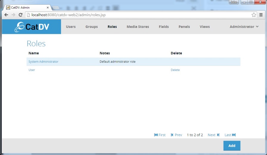
The page lists the existing Roles (initially just the System Administrator role) and provides access to the functions for adding, editing and deleting roles.
Create/Edit New Role
To create a new Role click the Add button in the footer bar, or to edit and existing Role click on its name in the list. This will display the New/Edit Role Dialog:
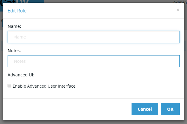
The Edit/New Role dialog contains the following fields:
Name – short name for the Production Group.
Notes – longer informative description the Production Group.
Advanced UI – enabled the Advanced UI option on the CatDV desktop client for users with this Role.
Production Groups
The Production Groups page is accessed via the ‘Groups’ admin toolbar/menu item:
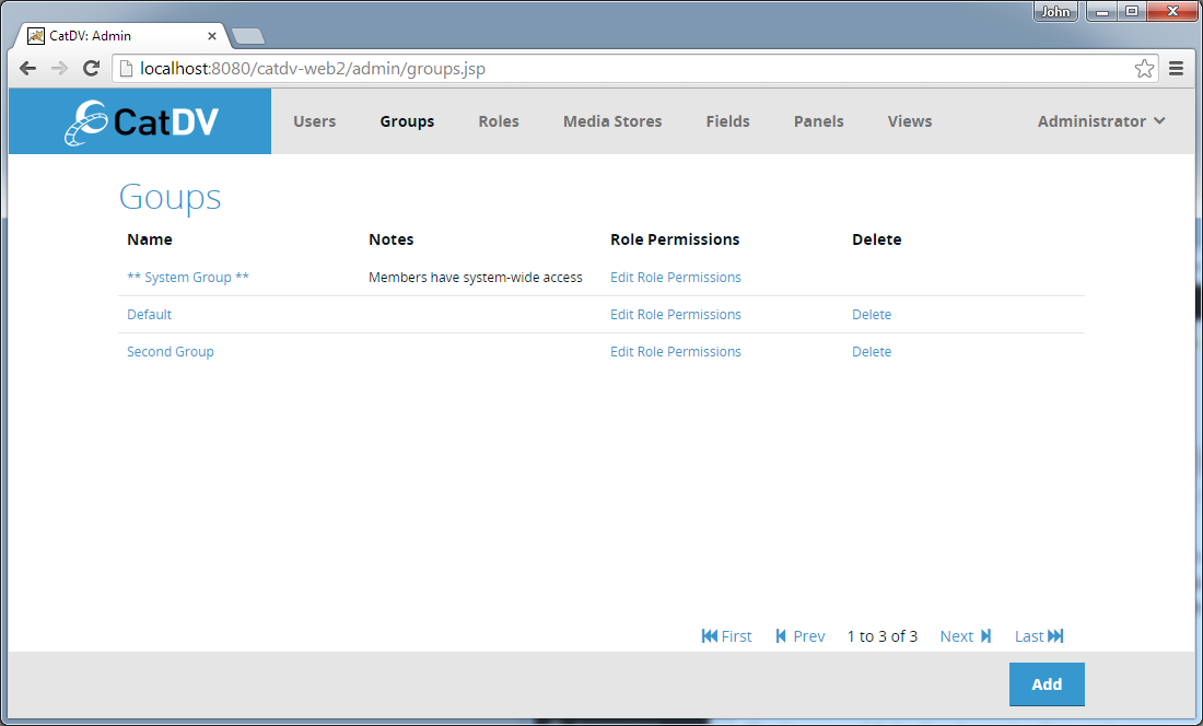
The page lists the existing Production Groups (initially just the System Group) and provides access to the functions for adding, editing and deleting groups and for setting the permissions of each Role within each Production Group.
Create New Production Group
To create a new Production Group click the Add button in the footer bar. This will display the New/Edit Production Group Dialog:
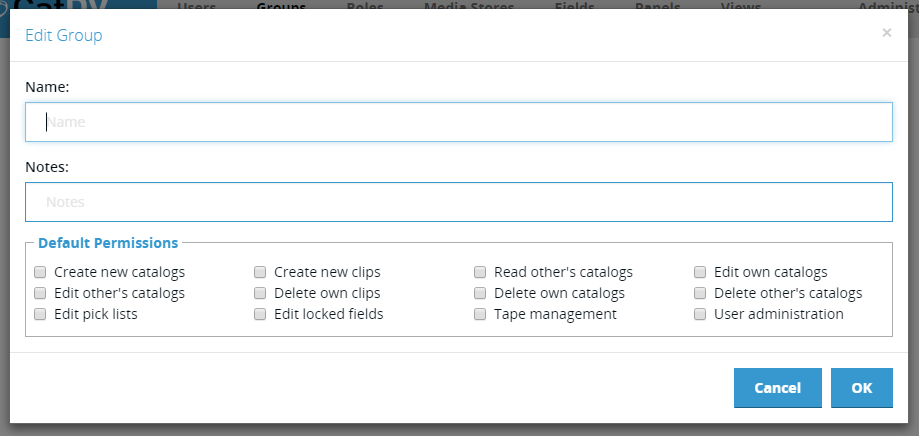
The Edit/New Production Group dialog contains the following fields:
Name – short name for the Production Group.
Description – longer informative description the Production Group.
Default Permissions – define the Permissions that will be assigned to new members of the group as they are added (see below for a description of the available Permissions).
Edit Role Permissions
Clicking on the Edit Role Permissions link in the Production Group list displays the Edit Role Permission dialog:
The dialog displays a list of all the defined Roles at the top left.
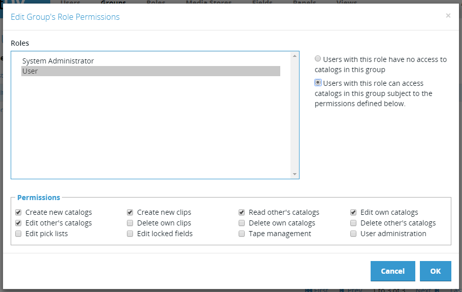
Selecting a Role in the list updates the other information in the dialog to reflect the current status of the selected Role in the current Production Group.
Immediately to the right of the list is a set of radio buttons that select whether Users with the selected Role can or cannot access catalogs in the current Production Group. If not then the Permissions panel at the bottom of the screen is greyed out, but if they can then the Permissions panel shows the permissions that apply to the user’s access.
The definitions of the available permissions are:
Create new catalogs – allow role members to create a new catalog in this Production Group.
Read other users’ catalogs – allow role members to open all catalogs in this Production Group, in addition to any owned by the user.
Edit pick lists – allow role members to edit pick list values for that Production Group
Create new clips – allow role members to import new clips or create new subclips within an existing catalog.
Edit own catalogs – allow role members to edit catalogs that they have published to the server – otherwise they become locked once they have been published.
Edit other users’ catalogs – allow role members to edit any catalog belonging to the Production Group.
Delete own clips – allow role members to delete clips in catalogs they have published.
Delete own catalogs – allow role members to delete catalogs that they have published.
Delete others – allow role members to delete other users’ clips and/or catalogs within this Production Group, in addition to those belonging to them.
Tape management – allow role members to create and edit tape information
User administration – allow role members to create new users and change their permissions within this Production Group.
System administration – allow role members to create new Production Groups and edit any permission, effectively the “super user”.
Edit pick lists – allow role members to edit pick list values for that Production Group.
Edit locked fields – allow role members to edit fields that have been marked as locked in the user-defined fields section of Preferences; normally such fields are read-only.
These permissions all apply to the currently selected Role/Production Group. A Role can have different permissions in different Production Groups, giving you great flexibility in setting up access control if you need it. You can also give a Role access to the special System Group; any permission set in this group will apply to the entire database, regardless of which production group the catalog belongs to.
Current Group
A user has a single Role. A Role gives them access to one or more Production Groups, with their permissions in each group determined by the permission set in the admin. Therefore a user has access to more than one group.
In the desktop client when a user logs in they must choose one of those groups – and that determines which set of preferences the client loads from the server which defines all the preferences for the session – including panels, views, and everything else (proxy settings, path mappings etc. that have nothing much to do with groups, but that is how it has always worked).
In Server 7.3 we have introduced the concept of a current group in the web client, like the desktop client has, but it is not compulsory and you can turn that menu off now.
However, in the web client, the user’s current group is not so all embracing – it only affects two specific things:
1. Visibility rules that are based on the USER’s group (NOT the asset’s group) so Views – yes, Panels – no (goes for the asset’s group). Workspaces – yes.
Group based admin Server 7.3 allows non-system admin users access to a cut down version of the admin UI. But they can only access things specific to the group they are allowed to admin, so only non-shared panels, views etc. that have been set up by the system admin. If the user can admin more than one group, then the current group is used to determine which group they are current administering, so it will change what data they see. That is the only case where that is true.
User Management
User Administration is performed using the User Admin section of the new web-based administration interface available through the Admin Menu of the Web 2 interface.
User Administration Page
The User Administration page displays a list of the currently defined users.
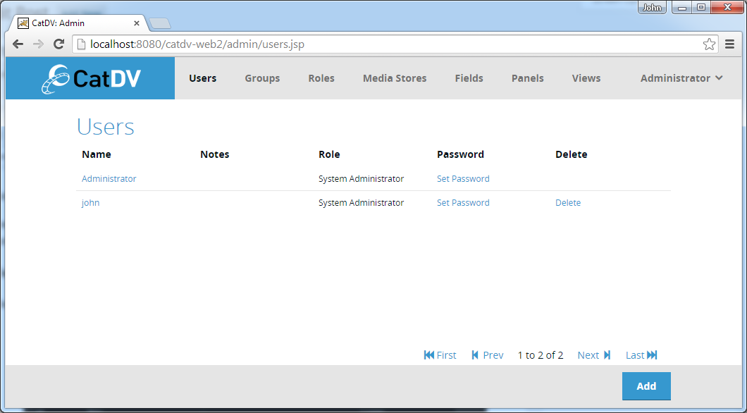
For each user the list displays their name, notes and the role that they have been assigned.
Create New User
To create a new User click the Add button in the footer bar. This will display the Create New User Dialog:
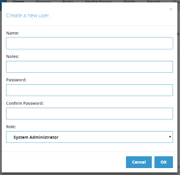
The Create New User dialog contains the following fields:
Name – the user name that the user will use to log into the system with .
Notes – any descriptive notes about the user.
Password/Confirm Password – the password the user will use to log in. Can be blank.
Role – drop-down list to select the Role the user will have. This will determine the permissions the user has on the system.
Edit User
To edit and existing User click on their name in the user list. This will display the Edit User Dialog:
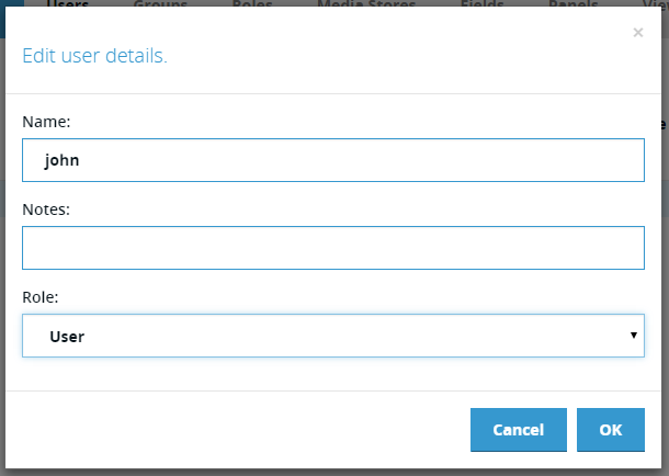
The Edit/New User dialog contains the following fields:
Name – the user name that the user will use to log into the system with .
Notes – any descriptive notes about the user.
Role – drop-down list to select the Role the user will have. This will determine the permissions the user has on the system.
Set Password
To set or change the password for an existing user click the on the Set Password link in the user list. This will display the Chang Password Dialog:
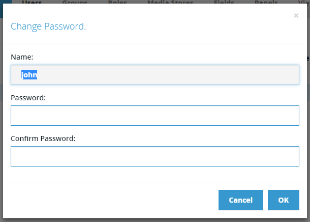
The Change Password dialog contains the following fields:
Name – (read only) the user name of the user whose password is being changed.
Password/Confirm Password – the password the user will use to log in. Can be blank.
User-defined Fields
The real power of CatDV lies in its ability to hold custom metadata against assets stored in its catalogs. This custom metadata can hold just about any information that a given workflow or business process requires.
Custom metadata is stored as a set of user-defined fields associated with each asset object (catalog, clip, marker, source media, import source or clip list). Each user-defined field has a unique identifier, a display name and a type. The type specifies both what kind of data is to be stored (text, number, date etc.) but also the user interface element used to enter that data (simple text field, picklist etc.). Certain field types have additional configuration data, such as the set of values for a picklist, or the color of a select button.
User-defined Field Types
Each user-defined field in CatDV has a specified type, that determines both the type of data stored in the field and the user interface for entering that data.
This section details the supported types:
Plain Text
A single line of plain text value edited using a single line text input control.
Multiline Text
A multi-line text value (i.e. one that can contain newline characters) edited using a multi-line line “text area” input control.
Picklist
A text value selected from a list of pre-defined values (the picklist). The picklist field supports additional options:
· Extendable – the user is allowed to enter a value that is not in the predefined value list.
· Saves Values – values entered by the user that are not in the set of predefined values are added to that list on the fly and saved for subsequent use.
· Keep Sorted – values are automatically sorted into alphabetical order
Multi-select Picklist
A set of text values selected from a list of predefined values (the picklist). The user may select more than one value from the list, and they are stored as multiple independent values in the field. The same options (Extendable, Saves Values etc.) that apply to simple picklists also apply to multi-select picklists.
Auto-suggest
Similar to a simple picklist but as the user types a value into the input field the list of picklist values is dynamically filtered to just those values that start with the text the user has typed so far. This is useful for large picklists.
Multi-value Auto-suggest
Provides the same functionality as the auto-suggest picklist field but allows the user to select more than one value.
Hierarchical List
Allows the user to select a value from a set of predefined values, by drilling down through a hierarchical tree. This is useful for presenting a large number of values that naturally form a hierarchy (such as selecting a city by first selecting the continent abd then the country and then the city).
Multi-select Hierarchical List
Provides the same functionality as the hierarchical list field but allows the user to select more than one value.
Checkbox
A true/false value edited by ticking a checkbox control.
Multiple Checkboxes
A set of text values edited by ticking one or more checkbox controls. The set of values is defined in the field definition’s data section.
Radio Buttons
A single text value chosen by selecting one of a set of radio button controls. The set of values is defined in the field definition’s data section.
Select Buttons
A single text value chosen by clicking one of a set of buttons. The set of available values is defined in a picklist associated with the field definition. The selected button is displayed in a bolder color and shows a tick to indicate it has been selected.
The color (or colors) of the buttons can be specified in the field definition’s data section. To define a color to be shared by all the buttons the data field should contain a single CSS color value. To define separate colors for each value a color lookup table can be provided, with one entry per line consisting of value:color. For example
Apple:green
Banana:yellow
Grape:#FF00FF
Multi-Select Buttons
Provides the same functionality as the select buttons field but allows the user to select more than one value.
Date
A date value selected using a date picker control.
Time
A time value selected using a time picker control.
Date and Time
A date and time value selected using a date/time picker control.
Number
A number (integer or floating point) value.
Identifier
A text value with constraints on the allowed characters that may be entered to ensure that value is appropriate for use as an identifier.
No Punctuation
A text value with constraints on the allowed characters that may be entered to ensure that value contains no punctuation.
Regex Validated
A text value with constraints on the allowed characters that may be entered based on a regular expression stored in the field definition’s data section.
Rating
A number value from 0 to 5 entered by selecting from zero to five stars.
HTML
An HTML formatted read-only field – usually set from a worker action or JavaScript – that allows static data to be presented with embedded formatting (e.g. a table of data). The HTML may contain special clip link URLs using the ‘catdv://’ protocol – e.g. catdv://clips/1234, which, if clicked, would take the user to the clip whose ID was 1234.
JSON Value
A JSON formatted read-only field – usually set from a worker action or JavaScript – that allows structured data to be stored. Commonly JSON fields are used purely by background workflows to store data against an asset. However they may be displayed in the user interface is desired. By default the raw JSON is displayed (mainly useful for debugging), but an HTML template can be specified in the data field of the field definition that can be used to format the JSON data as HTML for display.
HTML Templates
A HTML template is a block of HTML text with additional special tags (enclosed in <% %>) plus variable substitutions (${variable}) that allow a JSON object to be formatted as HTML.
This is an example template:
<h2>${result}</h2>
<table width="100%" border="1">
<tr><th>Name</th><th>Format</th></tr>
<%for(clip:clips)%>
<tr><td>${clip.name}</td><td>${clip.format}</td></tr>
<%endfor%>
</table>
The template is essentially HTML with some additional tags to allow the HTML to display data extracted from the JSON data object stored in the Job object.
To display a single value the following variable reference may be used:
${variable_name}
${object_variable_name.propertyName}
This substitutes the value of the variable into that position.
If the JSON contains an array of values these can be iterated over using the following tag:
<%for(loop_variable:array_variable>%>
<%endfor%>
This will repeatedly apply the template contained within the open and close tags setting the loop_variable to each value in the array. Note this loop_variable may be an object.
Parts of the template can be optionally emitted based on the following tags
<%if(variable)%>
<%else%>
<%endif%>
If the specified variable is set then this outputs the first part otherwise the else part.
For example – if the value of the JSON was:
{
"clips": [
{ "name": "clip 1" , "format": "mp4"},
{ "name": "clip 2" , "format": "mp4"},
{ "name": "clip 3" , "format": "mp4"}
],
"result" : "Success"
}
And the template from jobDataDesc was:
<h2>${result}</h2>
<table width="100%" border="1">
<tr><th>Name</th><th>Format</th></tr>
<%for(clip:clips)%>
<tr><td>${clip.name}</td><td>${clip.format}</td></tr>
<%endfor%>
</table>
Then the result would be:
Success
Name | Format |
clip 1 | mp4 |
clip 2 | mp4 |
clip 3 | mp4 |
Calculated
A calculated field does not store a value, instead the displayed value is calculated on the fly using either JavaScript or simple variable substitution.
An example of variable substation:
The name of the clip is ${clip.name}
A simple JavaScript to accomplish the same thing would be:
js:”The name of the clip is” + clip.get(“clip.name”)
Note that the JavaScript expression must start with ‘js:’
Colored Labels
The value returned by a calculated field may be prefixed with a color value that is displayed as a colored background behind the result. For example:
js:”#FF0000:This text will be displayed on a red background”
Calculated Picklist
The calculated picklist field provides the same functionality as a regular picklist field, but the set of values the user selects from is calculated on the fly using JavaScript.
The script can also make use of any of the usual CatDV.* functions from the CatDV JavaScript API, and can access the following scope variables:
· picklistValues – an array of strings containing the pre-defined picklist values if present
· clip – the currently selected clip
To allow asynchronous operations to be performed the picklist values are returned to CatDV using the following callback:
· setValues(values:string[]) - callback function to return the clip list values to CatDV
Example
var values = [];
for(var i=0; i < 10; i++)
{
values.push(“Value “ + i);
}
setValues(values);
Calculated Multi-select Picklist
Provides the same functionality as the calculated picklist field but allows the user to select more than one value.
Coloured Label
A very common use case for calculated fields is to display colored status indicators (for example showing a green label to indicate a background operation, such as a transcode or archiving, has completed successfully, and a red label to indicate it has failed).
The colored label field is simply a calculated field, but with a wizard that generates the required JavaScript to display different values from a specified field in an appropriate color.
Clip Updated Flag
Special field type that is automatically set to the value specified in the field definition’s data field whenever a clip is updated. This field is intended to be used to drive change-based workflows (for example copy all new or modified clips to another server).
For example, if a ‘Clip Updated Field’ called ‘Send Status’ were created with a data field of ‘Send to Remote Server’ then every time a new clip was created, or any change was made to an existing clip, then the ‘Send Status’ field would automatically be set to ‘Send to Remote Server’. Thus a worker server query action that looked for clips with the ‘Send Status’ field set to ‘Send to Remote Server’ would trigger whenever a new clip was created or whenever any change was made to any clip.
Linked Picklists
A common requirement is restrict the set of values a user can select from a picklist based on other values set on the same clip to implement taxonomy entry. For example it might be desirable to log the location of some footage by selecting the country an then having a separate ‘city’ picklist just show the cities within that country. This can be achieved using linked picklists.
In CatDV any picklist can be linked to any other field by entering the field identifier of the other field into the Linked to Field section of the picklist editing form. When a picklist is linked to another field, the values displayed in the picklist are filtered based on the value of the linked field. To indicate which values should be displayed for each linked value, the picklist values must use a special format:
<linked_field_value>/<picklist_value>
For example – using the country/city example about – the city picklist might look like:
England/London
England/Manchester
England/Sheffield
France/Paris
France/Lyon
Germany/Berlin
Germany/Frankfurt
It is possible to link to more than one field by specifying multiple field identifiers in the link to field section, separated by a ‘/’ character. The picklist values would then need to take the form:
<linked_field1_value>/<linked_field2_value>/<<picklist_value>
Managing User-defined Fields
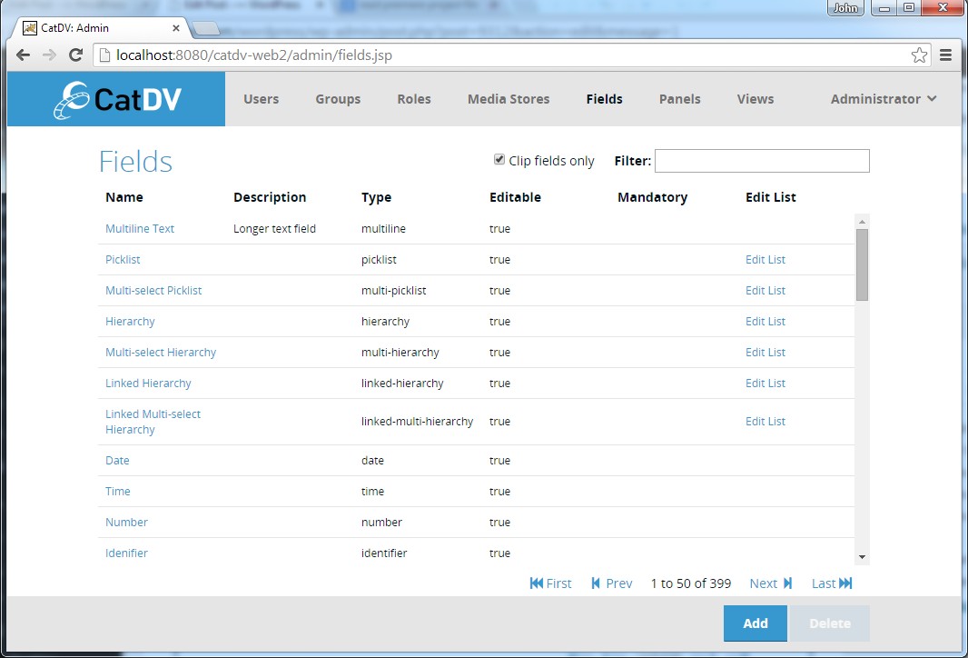
Clicking Fields in the admin toolbar displays the list of currently defined Fields.
If the CatDV Server has been upgraded from a previous version then this list will already contain any user-defined fields that have been migrated from Server 6 to Server 7.
The list displays the following fields:
Name – the user-visible name of the field, which will be used as the label when the field appears in the UI. Hovering over the name displays the internal identifier for the field. Clicking on the name opens the edit dialog.
Description – longer description of the field that is displayed as a tooltip in some clients.
Type – specifies the kind of information that can be stored and the type of UI control that will be used by the user to enter it
Editable – can the user change the value in this field.
Mandatory – if true the user must fill this value in before they are allowed to save the clip.
Edit List – for field types where the user selects a value from a list clicking the Edit List link opens the Edit List dialog.
The default behaviour is for the list to only show Clip fields, since are the most common. Uncheck the “Clip Fields Only” checkbox to see all user-defined fields. Be aware that CatDV dynamically creates custom fields for Source Media and Import Source objects to store metadata extracted from media files.
You can filter the list of displayed fields by typing a string into the Filter box. You can also
Create a User-Defined Field
To create a new User-Defined Field click the Add button in the footer. This will open the Create/Edit Field Definition dialog:
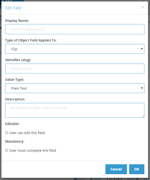
The Create/Edit Field dialog contains the following fields: The list displays the following fields:
Display Name – the user-visible name of the field, which will be used as the label when the field appears in the UI.
Type of Object Field Applies To – specifies which object (Catalog, Clip, Marker etc.) this field applies to.
Identifier (slug) – internal unique name used to identify a field in API calls. For example if a clip field existed with the identifier ‘my.field’ then the JSON clip object would look like:
{ "ID": 1234, ..., "userFields": { "my.field" : "some value"}}
When used in a clip query this field would be referenced by:
((clip[my.field])eq(some value))
Type – specifies the kind of information that can be stored and the type of UI control that will be used by the user to enter it
Description – longer description of the field that is displayed as a tooltip in some clients.
Editable – can the user change the value in this field
Mandatory – if true the user must fill this value in before they are allowed to save the clip.
Edit List – for field types where the user selects a value from a list clicking the Edit List link opens the Edit List dialog.
Edit List Values
Clicking on the Edit list link in the field list brings up the Edit List dialog:
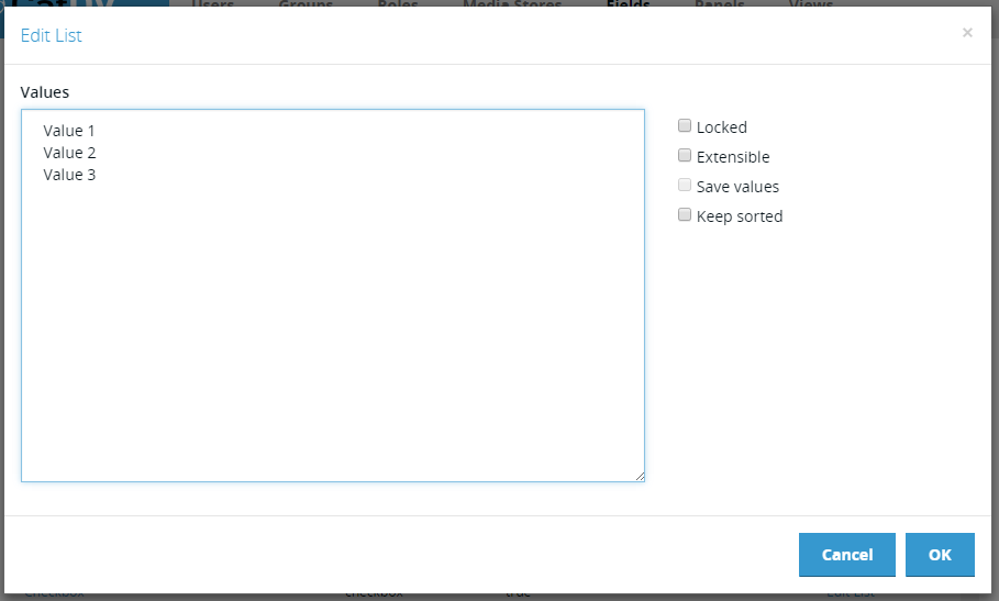
The list values are entered into the Values field on the left. This is a single multi-line text field, where each line is one value. This makes it very easy to edit the values and also to copy/paste them from another document.
There are four options that can be set on picklists:
Locked – the values can only be changed by an administrator.
Extensible – user is allowed to enter values that are not in the list.
Save Values – new values entered are saved to the list (not all clients support this).
Keep Sorted – values are automatically sorted alphabetically.
Custom Panels and Views
In CatDV clip data is displayed in two contexts:
Views – lists of clips presented as a table, a grid or set of film-strips.
Detail Panels – detailed information about a single clip displayed in a set of tabs.
It is possible to customise both views and panels using the web-based administration interface.
View Sets and Panel Sets
It is often useful to consider a set of panels or views as a single item. For example the set of panels that might be relevant to a single production group or the set of panels to display in the web client. For this reason all panels and views are groups into sets which are referred to as Panel Sets and View Sets.
Custom Panels and Views
Due to the similarity in managing panels and views they will be treated together. Selecting either Panels or Views from the toolbar displays the Panels or Views list:
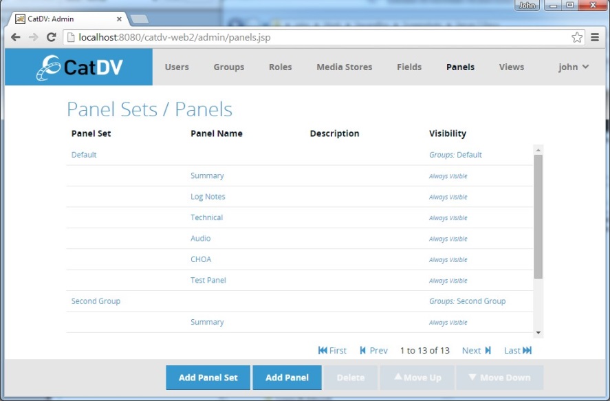
The panel/view list displays the following columns:
Panel/View Set – the set that contains the panels/views that appear in the proceeding rows. Click on the panel/view set name to edit it.
Panel/View Name – name of an individual panel or view. Click on this to edit the panel/view.
Description – longer description of the item.
Visibility – shows a summary of the visibility rules that apply to the set or individual panel or view. Rules defined at the set level determine whether the set as a whole is visible in a given situation. Only if the set as a whole is visible to the rules defined on individual item come into play.
Edit Panel
The Edit Panel dialog allows the user to create or edit clip detail panels:
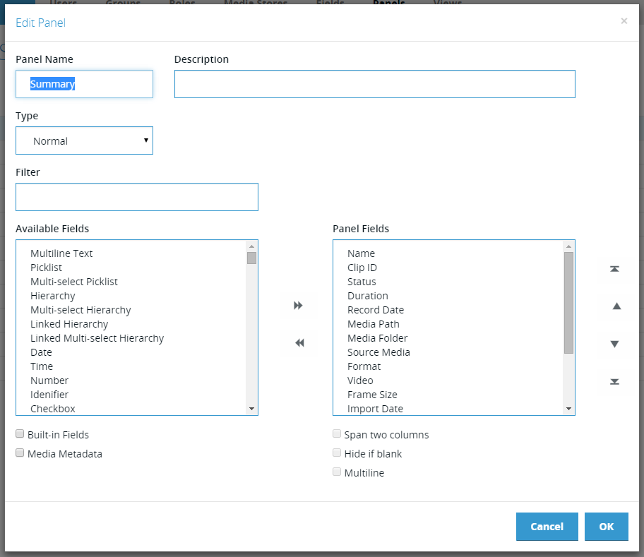
It has the following fields:
Panel Name – the name of the panel, which will be used as the tab title in the UI.
Description – longer description that specifies the purpose of the panel
Type – the type of tab to display:
Normal – normal detail panel containing editable fields
HTML Summary – a formatted read only view of the metadata
Built-in – a non-editable built-in panel. To make editable change type to one of the other two types.
Filter – filters the list of available fields for fields whose name contains the entered text
Available Fields – lists the available fields that can be added to the panel
Built-in Fields – if ticked includes built-in fields in the available fields list.
Media Metadata – if ticked includes Source Media metadata fields in the available fields list. Note: Source Media metadata fields includes fields extracted from media files and can be very long
Panel Fields – fields that should appear in this panel, in the order that they should appear. User the left/right arrows between the two lists to add/remove items or simply drag and drop items from one list to the other. Use the up/down arrows to the right of the list to change the order of the fields.
Span two columns – if ticked the selected panel field should be displayed across two column in client that support this feature
Hide if blank – if ticked the selected panel should should not be displayed if there is no value stored against it
Multi-line – if ticked the field should be displayed across multiple rows in the UI.
Edit View
The Edit View dialog allows the user to create or edit clip list views:
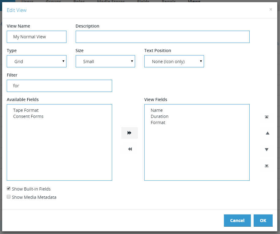
It has the following fields:
View Name – the name of the view, which will be used as the menu item title in the UI.
Description – longer description that specifies the purpose of the view
Type – the type of tab to display:
List– tabular clip view with rows and columns like a spreadsheet
Grid – a grid of clips showing image thumbnails and some text
Filmstrip – a list of film strips each of which shows a set of thumbnails for the clip.
Built-in – a non-editable built-in view. To make editable change type to one of the other types.
Options – options that apply the selected view type.
Filter – filters the list of available fields for fields whose name contains the entered text
Available Fields – lists the available fields that can be added to the view.
Built-in Fields – if ticked includes built-in fields in the available fields list.
Media Metadata – if ticked includes Source Media metadata fields in the available fields list. Note: Source Media metadata fields includes fields extracted from media files and can be very long
View Fields – fields that should appear in this view, in the order that they should appear. User the left/right arrows between the two lists to add/remove items or simply drag and drop items from one list to the other. Use the up/down arrows to the right of the list to change the order of the fields.
Visibility Rules
The Edit Visibility dialog allows the user to control under what conditions different panels and views will be visible:
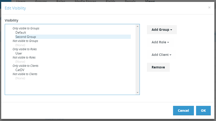
The dialog displays a list of the current visibility rules divided in three sets of two groups:
Only/Not visible to Groups – the view or panel will (only be visible/not be visible) when viewing a clip in one of the listed production groups, or when they are logged in to one of those groups (CatDV desktop client only)
Only/Not visible to Roles – the view or panel will (only be visible/not be visible) to users with one of the listed groups
Only/Not visible to Clients – the view or panel will (only be visible/not be visible) when viewed using one of the listed clients.
Media Stores
CatDV traditionally uses a set of Path Mapping rules to map between original media and the matching proxy files, and also to handle the different paths required to access the same media from different machines (e.g. mapping between Mac and Windows paths). This mechanism is extremely powerful and flexible, but has been something that users have often found confusing and error-prone. Server 7 introduces the concept of ‘Media Stores’ to provide the same functionality in a (hopefully) easier to understand way.
A Media Store represents a single physical repository for media – for example a shared folder on a SAN. A Media Store may have several paths, each of which targets a particular platform or use. For example a Media Store might have one path for use by Mac clients and another for use by Windows clients. It will also typically define one or more paths where the proxy media for the media on the media store is located and, if appropriate, might have a URL where HTTP proxies can be served.
Media Stores currently determine how the server and the various REST API clients (Web Client, iOS apps, Premiere Panel etc.) access media and are managed through the new web-based administration interface. In the future it is intended that other clients such as the CatDV Worker would also make use of these centrally stored and managed media stores, but currently the CatDV Client and Worker still use the path-mapping approach.
Media Store Management
The Media Store management page is accessed from the Media Stores item in the toolbar:
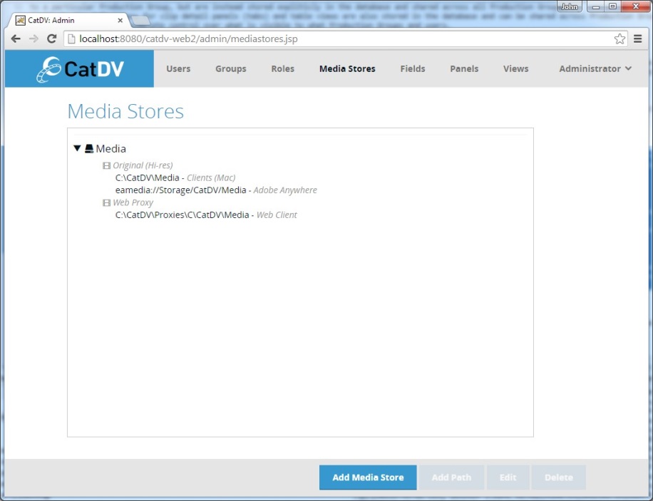
The Media Store management page displays a list of the currently defined Media Stores. Each Media Store contains one or more paths, which are displayed grouped into categories based on their type (Original media, Proxy media etc.).
Clicking Add Media in the footer will prompt for a name and then create a new empty media store.
Add/Edit Media Path
With a Media Store selected in the list the Add Path button will display the Edit Media Path dialog:
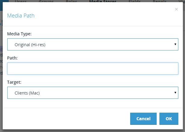
The Add/Edit Media Path dialog contains the following fields:
Media Type – the type of media references by this path
Original – (hires) media
Proxy – media for use by the desktop client
Web Proxy – media for use in any of the web-based clients
Path – the path itself
Target – the kind of client this path is intended for. This allows there to be multiple paths defined to access the same type of media. The most obvious use of this feature is to store different paths for Macs and Windows, which have different formats for paths. However it can also be used to handle the case where the server needs to access a file using a different path from a worker node. Currently available targets are::
Client (Mac) – CatDV desktop clients running on Mac OS X
Client (Windows) – CatDV desktop clients running on Windows
Web Client – any of the web clients
Worker – a worker node
Server – path local to the server
Adobe Anywhere – an eamedia:// path for use by Adobe Anywhere
Note that some items in this list (such as Worker) are intended for future use. Currently the Worker does not use the server-side path mappings. It is anticipated that this list will evolve over time.
Customising Web Interface
Web Workspaces
The CatDV Web 2 interface can be extensively customised through the use of Web Workspaces. A Web Workspace is a collection of settings that allow control over amongst other thing:
Theme – the colours and logos used in the interface
Navigation – which navigation options are available (browse catalogs, complex search etc.)
Clip Operations – which operations a user is allowed to perform on selected clips (creating/editing sequences, sharing links to clips etc.)
Import/Export – whether the user is allowed to upload or download media to and from the server.
Shopping Basket – whether the shopping basket functionality is available
Labels – override the names displayed for certain elements e.g. rename Catalogs as Collections.
Web Workspaces are managed in the Web Workspaces section of the Web Administration interface.
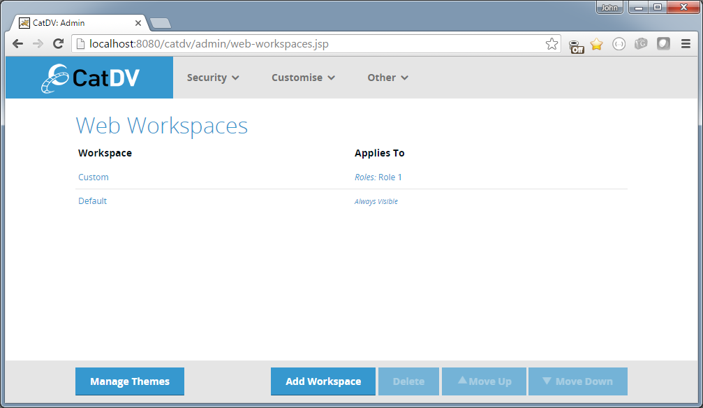
It is possible to define multiple Web Workspaces and set visibility rules for each one to control which workspace is applicable to different users.
Note that the order of the workspaces in the list is significant. The system starts at the top of the list and evaluates the visibility rules (settable through the link in the Applies To column) and if the rules match that workspace is used. If not then the next workspace in the list is tried. If no workspace matches then the default settings are used.
In the example above the last workspace ‘Default’ has visibility set to ‘Always Visible’ so will act as the fallback workspace that will be used by the log in screen – when the current user has not yet been determined.
Workspace Editor
Clicking on the name of the workspace or clicking Add Workspace brings up the Web Workspace Editor:
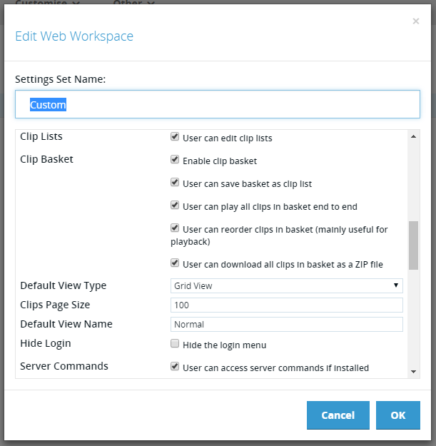
The name of the workspace can be set in the name field and the other settings can be set in the scrollable panel below. The settings themselves are hopefully fairly self-explanatory.
Custom Themes
The first item in the Workspace Editor settings list is the UI Theme. A theme is a collection of images and stylesheet values that control the visual appearance of the web interface.
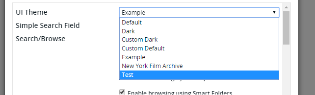
The user can select a theme for the workspace from a list of available themes.
By default the only themes available are Default and Dark, but it is possible to create new themes using the theme editor.
To manage the available themes click on the Manage Themes button in the footer of the Web Workspaces screen. This displays the Manage Themes page:
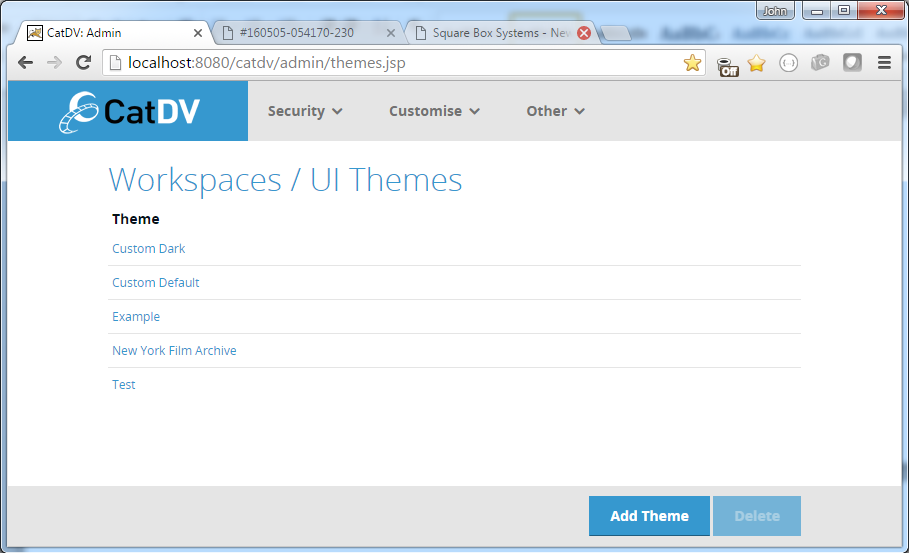
Note that the built-in themes Default and Dark do not appear in this list – only custom themes created by the user.
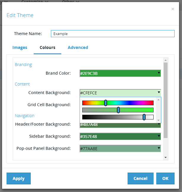
Theme Editor
Clicking on the name of one of the custom themes or clicking the Add Theme button brings up the Theme Editor. The Theme Editor has three tabs that allow editing of the images, main theme colours and advanced theme colours.
Theme Images
The Images tab allows a directory to be specified where the images for the theme will be read from.
NOTE: the directory must be readable by the user running the CatDV Server service/daemon.
Within the directory can be placed up to six images:
logo_main.png – logo at the top left of the main page. 240px x 120px
logo_other.png – logo at the top left of other pages. 240px x 60px
login_bg.jpg – background image for the login page.
header_main.png – background image for header on main page. 120px high.
header_other.png – background image for header on other pages. 60px high.
sprocket_hole.png – image used for the sprocket holes in the filmstrip view. 24px x 30px
The images must use the exact names specified and must be of the size specified.
It is not necessary to provide all of the images listed. The theme will fall back to the images from the built-in ‘Default’ theme for any images that are not present in the specified directory.
Main Theme Colours
The Theme Colours tab allows the colours of the main user interface regions to be defined. The regions are:
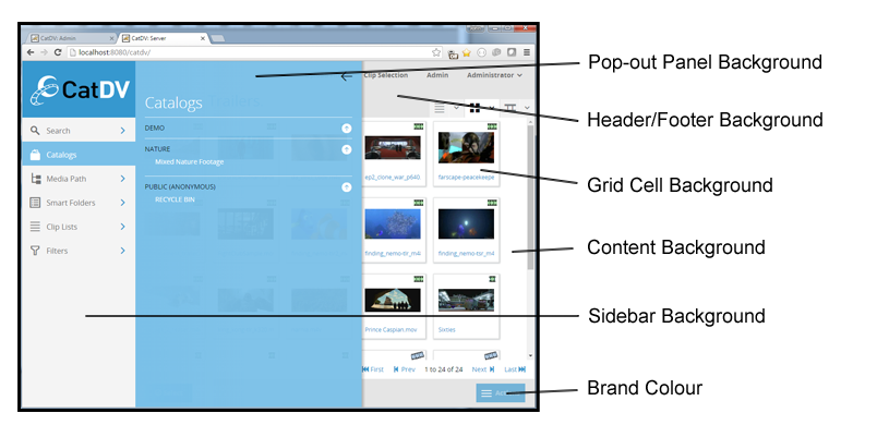
The current colour for each region is displayed in the background of associated colour picker along with the CSS hexadecimal representation:
Colours may be edited either by entering a new hexadecimal value or using the colour picker accessed via the drop down arrow. This allows the colour to be created by setting hue, saturation and brightness values via the associated sliders.
Advanced Theme Colours Tab
The colours that are defined in the Colours tab are principally the background colours for the various UI regions. Normally the corresponding foreground colours are set automatically depending on the background colours chosen. The Advanced tab allows these foreground colours to be overridden if required.
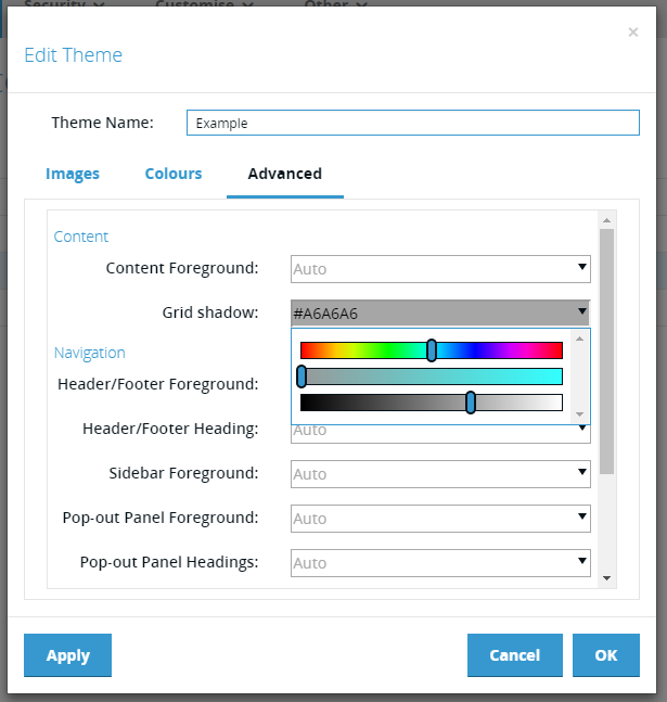
By default all the values in the “Advanced” tab are set to ‘Auto’, which means the values will be calculated by the theme generator. However it is possible to override these automatic values either by entering a CSS hexadecimal colour value or using the colour picker HSL sliders as in the “Colours” tab.
To reset the field to “Auto” simply delete the hexadecimal colour value.
Custom Toolbar Items
The workspace editor includes an option to specify additional, custom toolbar commands using a JSON (with JavaScript extensions) descriptor. For example, a simple toolbar command to link to another system might be:
[{
name: "Some Site",
link: "https://www.somesite.com"
}]
Note that the JSON specifies and array off toolbar commands (indicated by the open and close square brackets). You may include any number of commands (each within curly brackets).
Each ‘command’ can have the following properties:
// Display name - in menus, buttons etc.
name: string;
// Optional icon (from the Bootstrap Glyphicons set)
icon: string;
// Optional tooltip
tooltip: string;
// Optional CSS class
cssClass: string;
// Is this action currently enabled (default to true)
isEnabled: () => boolean;
// Is this action currently visible (default to true)
isVisible: () => boolean;
// Either:
// - callback to execute the action (evt: browser event that triggered command)
execute: (evt?: any) => void;
// - simple URL link
link: string;
Note you may include JavaScript code within the descriptor to implement methods such as isEnabled().